Your patient satisfaction scores went up by two points this month. YAY!
Your patient satisfaction scores went down three points the following month. Boo!
Those monthly scores feel like an emotional roller coaster, right? Then you add on all the other relevant quality outcome measures your employer has decided are important and it can get even more crazy and complex. Depending on your manager, they either take them very seriously or they understand the complexities of measuring patient outcomes.
How do we handle all the new data coming at us more sanely? Here's a solution.
Statistical Process Control. What is it? Here's a generally agreed upon definition:
Statistical process control (SPC) is a method of quality control which employs statistical methods to monitor and control a process. This helps to ensure that the process operates efficiently, producing more specification-conforming products with less waste (rework or scrap).
What SPC does is it tells you when your team's performance is normal and when it's not. It is specific to the patients YOU work with, so you're not compared inappropriately to others.
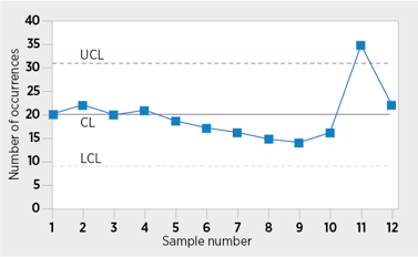
Here's what an SPC chart looks like:

See the two dotted lines? Any number within those two lines means the performance of the process is NORMAL. Ups and downs within the dotted lines are nothing to worry about.
That spike at point 11, however, that's something to be concerned about. That's when you go back to what happened that month. Were that patients sicker? Were you short-staffed? Was there a supply shortage that affected operations? Whatever the reason for the spike, you can take steps to proactively address the source of the problem. In this chart, the patient care delivery site dropped back to the normal range the following month. That means the team took the necessary steps to address the performance problem, whatever it's source.
This is what it means to use data wisely and effectively when delivering patient care. It's not hard to do and there are lots of tools and resources out there. Just be sure you get them from a reliable source.
Here's a link to a good resource for SPC from ASQ: https://asq.org/quality-resources/statistical-process-control
Comments
Post a Comment